UX research
This study asks a narrower question than the audit: not what is wrong with the store, but who is trying to use it and where it stops them. It is built from the catalogue, the store's own press and testimonial pages, the collection and product data in its Shopify endpoints, and four competitors measured the same way on the same day.
Personas
Three shopping modes rather than three demographics: the visitor buying before her flight, the customer who already owns two pieces, and the international shopper comparing three tabs. Every frustration listed below traces to a numbered finding in the audit.
Marisol, on the last day of the trip
34, a nurse from Sacramento, four days into a week on Oahu. She saw the lotus logo on a card in a North Shore shop and looked it up on her phone in the passenger seat. She is not researching — she wants one piece that will remind her of this week, and she is buying it today or not at all.
I want the thing I'd actually wear at home, not a souvenir. Show me the necklaces and I'll know in ten seconds.
- Shops on
- iPhone, one hand, in a moving car
- Budget
- $80 to $130
- Looking for
- A necklace with a stone, under $150
- Trusts
- Photographs of the piece being worn
What she is trying to do
- See the necklaces as a group and compare them quickly
- Understand what the stone is and what it is meant to mean
- Buy before the flight without creating an account
Where the store stops her
- A newsletter form covers the product photo the moment the page loads (F-01)
- The hero rotates, and the slide showing on arrival can be one that links off the store to a course signup (F-02)
- The only route to the catalogue on her phone is a 24 px hamburger (F-07)
- The buy button is 60 px below the bottom of her screen and there is no sticky bar (F-17)
What the redesign gives her
- A category row under the hero puts Necklaces one tap from arrival
- A sticky add-to-cart bar keeps the price and the button in reach the whole way down
- Gemstone and price filters narrow 102 products to the four she would actually consider
Kealoha, buying her third piece
41, lives in Kailua, has two Noelani pieces already and follows Noelani's music as well as the jewellery. She buys for herself at solstice and for her sister at Christmas. She knows the collection names and comes looking for them by name.
I know there's a Pikake line. I just can't find it from the menu, so I search and hope.
- Shops on
- Laptop, evening, unhurried
- Budget
- $100 to $300, often two pieces
- Looking for
- New pieces in the named collections
- Trusts
- The brand already — she owns it
What she is trying to do
- Find the Pikake, Mana and Haleakalā collections by name
- See what has been added since her last order
- Buy a gift and a piece for herself in one order
Where the store stops her
- Twelve of the eighteen collections are not linked anywhere in the menu (F-06)
- Search returns a grid with no count and no way to sort or narrow it (F-22)
- The cart is a full page redirect, so adding a second piece means going back (F-23)
- Nothing tells her she is $32 short of the free shipping she already knows exists (F-23)
What the redesign gives her
- A 'Shop by collection' column in the menu names Pikake, Mana, Haleakalā, Harmony, Mo'orea and Pearls
- A cart drawer lets her add a second piece without leaving the product page
- A free-shipping progress bar tells her exactly what one more item is worth
Rina, comparing three shops from Tokyo
29, in Setagaya, found Noelani through a Hawaii Magazine Japan feature. She has Satya and one Japanese brand open in other tabs. She has bought from US stores before and knows the two things that go wrong: the price in yen and whether it ships.
The currency switches to yen, so it probably ships. But I want to read what the stone means before I commit.
- Shops on
- iPhone, late evening JST
- Budget
- ¥15,000 to ¥25,000
- Looking for
- A meaningful piece, and proof it ships to Japan
- Trusts
- Reviews, press, and a clear returns line
What she is trying to do
- Confirm the piece ships to Japan and see the price in yen
- Read what the gemstone and the affirmation mean
- Check that other people have bought this and been happy
Where the store stops her
- The Reviews tab on the product page opens to nothing (F-19)
- Product headings carry Japanese as a suffix rather than the store having a Japanese version (F-26)
- Fifteen years of press, including Hawaii Magazine Japan, never appears on a page that sells (F-28)
- No structured data means the Google result she arrived from showed no price or stock (F-18)
What the redesign gives her
- A Japanese locale through Shopify Markets, switched beside the currency
- Star ratings under the product title, seeded from the existing testimonials
- An 'As seen in' strip on the product page carrying the Japanese press she already recognises
Shopping journeys
One journey per persona, walked step by step on the live store. The left column is what the site does today; the right is what the redesign does instead.
Buying one necklace on a phone, in under five minutes
Marisol, on the last day of the trip
The most valuable journey on the store and the one the current layout handles worst. Every step below was walked on the live site at 390 x 844.
Lands on the homepage from a search
Today
A two-line all-caps announcement bar, then the header, then whichever of five auto-rotating slides happens to be showing. No product and no category is visible either way.
Proposed
A jewellery hero with one piece and one button, then a four-tile category row — Earrings, Necklaces, Bracelets, Rings — inside the first screen after the hero.
Tries to reach the necklaces
Today
A newsletter modal opens over the page. She closes it, then hunts for the 24 x 24 px hamburger, opens it, and finds JEWELRY among five items, four of which are about music and events.
Proposed
She taps Necklaces in the category row. No modal, no menu, one tap.
Scans the necklaces
Today
A full-screen banner image loads first; the products start below it. There is no filter, so 102 items are one long scroll sorted by 'Featured'.
Proposed
A 240 px banner, then the grid immediately, with Gemstone, Price and Type filters above it. She sets Price under $150.
Opens a piece she likes
Today
The modal reappears over the product image. Behind it: an all-caps title, the photo, and the price at the very bottom edge of the screen.
Proposed
Title in sentence case, image, price, star rating, and the metal choice as two labelled buttons — all inside the first screen.
Reads the description and decides
Today
She scrolls past the description and the bilingual 14k gold fill accordion to an empty Reviews tab. The Add to Cart button is now 900 px above her.
Proposed
A sticky bar at the bottom of the screen carries the name, the price and Add to cart the whole way down. Reviews are real and sit under the price.
Buys
Today
She scrolls back up, taps Add to Cart, and the site leaves the product page for a full cart page.
Proposed
The cart slides in over the product page showing 'You're $32 away from free US shipping', with Shop Pay as the first option.
Today's route asks her to dismiss a modal twice, find a 24 px button, scroll past a banner, and scroll back up 900 px to reach a buy button she has already read past. Any one of those is survivable; together they are why a visitor with her card already out leaves without ordering.
Finding a named collection and adding a second piece
Kealoha, buying her third piece
A customer who already trusts the brand and knows what she is looking for. The store makes her work harder than a stranger would tolerate.
Looks for the Pikake collection
Today
Opens the JEWELRY dropdown. Pikake is not there — the dropdown lists six category collections. She either uses search or clicks through to the /collections index.
Proposed
The dropdown has two columns. 'Shop by collection' lists Pikake, Mana, Haleakalā, Harmony, Mo'orea and Pearls by name.
Searches 'pikake' instead
Today
The results heading reads 'Search results for "pikake":' with a trailing colon. No count, no filters, no sort. She scrolls to see how many there are.
Proposed
'7 results for pikake', with the same Gemstone, Price and Type filters as the collection pages.
Adds a necklace for her sister
Today
The card's only control reads 'SELECT OPTIONS ›'. She taps it, lands on the product page, and adds to cart. The site loads a separate cart page.
Proposed
The card is a link; the product page adds to a slide-out drawer. She stays on the page.
Decides whether to add a second piece
Today
The cart shows a subtotal and a checkout button. The $150 free shipping threshold from the announcement bar is not mentioned, so at $118 she has no reason to add anything.
Proposed
'You're $32 away from free US shipping' sits at the top of the drawer, with a row of pieces under $50 beneath it.
Checks out
Today
Full page cart, then Shopify checkout. Shop Pay is available.
Proposed
Same checkout, reached from the drawer without losing her place.
Today's route ends in a $118 order. The proposed route makes the $150 threshold visible at the exact moment one more item is a rational choice — which is the difference between a $118 order and a $150 one, on a customer who was already going to buy.
Deciding whether to trust the shop from 6,000 km away
Rina, comparing three shops from Tokyo
A customer the store has already earned through fifteen years of Japanese press, meeting a storefront that does not show her any of it.
Arrives from a Google result
Today
The listing shows a title and a description. No price, no stock, no rating, because the store publishes no JSON-LD at all.
Proposed
The listing shows ¥ price, In stock, and a star rating, from a Product schema block on the template.
Checks the price in yen
Today
The currency switcher offers JPY among six currencies and the price converts. This already works and is a real strength.
Proposed
Unchanged — plus a Japanese locale switch beside it.
Reads what the stone means
Today
The description is good. Below it, an accordion heading reads 'WHAT IS 14K GOLD FILL? とは?お手入れ方法は?' — both languages jammed into one heading.
Proposed
The store has a Japanese locale through Shopify Markets. She reads the whole page in Japanese, and the heading is one language.
Looks for proof other people have bought this
Today
The Reviews tab opens to nothing. There is a /pages/testimonials page, but nothing links to it from the product.
Proposed
A star rating under the title and real reviews below the description, seeded from the existing testimonials.
Looks for a reason to trust the brand
Today
26 press pages are published, including Hawaii Magazine Japan and Yolo Japan. None of them appear on the product page or above the fold on the homepage.
Proposed
An 'As seen in' strip under the buy button carrying the Japanese titles she recognises.
Today's route ends with her closing the tab and buying from the Japanese brand, not because the piece is worse but because the page gave her nothing to check. What is frustrating is that the trust material already exists on this site — it is filed on 26 separate pages nobody links to. This one is a placement problem, not a content problem, which makes it the cheapest of the three to fix.
Competitors
Four stores, chosen as one close peer, one thematic peer, one Hawaii benchmark and one adjacent brand at a different price point. Each was loaded in the same browser at the same viewport on 7 September 2026, and everything below is what could be measured or seen.
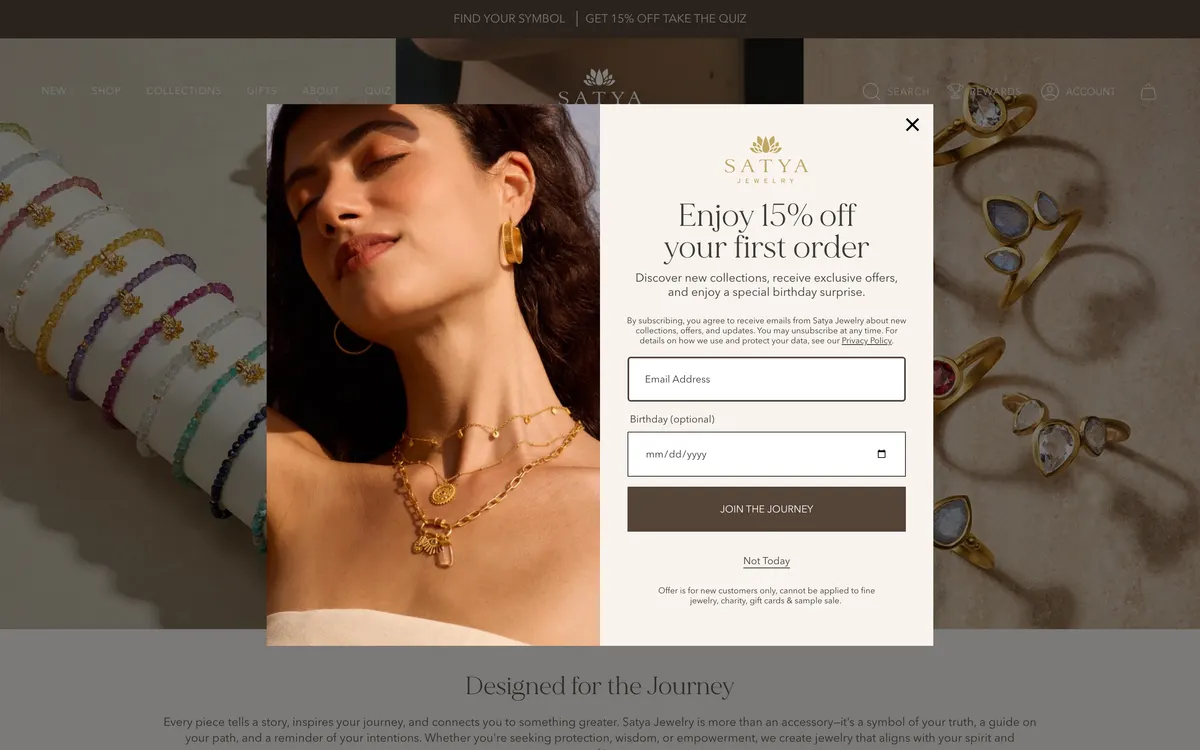
Satya Jewelry
The closest peer in the set: gemstone jewellery sold on meaning and intention, at a similar price point, run at a larger scale.
satyajewelry.com- Six items in the top-level menu — New, Shop, Collections, Gifts, About, Quiz — of which four lead to something to buy. Like this store, the category names themselves live inside a Shop dropdown.
- A real search field in the header, labelled Search, rather than an icon that opens one.
- Four JSON-LD blocks on the homepage, against zero on noelanihawaii.com.
- Header is 128 px against 176 px here, on the same 900 px screen.
- In fairness: Satya runs a first-order newsletter popup too, as the screenshot shows. Two differences — it sits below the header rather than over it, and it offers a 'Not Today' link as well as a close cross.
Worth borrowingThe top bar. Satya spends its most valuable strip on 'Find your symbol — take the quiz', a route into the catalogue for someone who does not yet know what they want. This store spends the same strip on a sale banner and nothing else.
Awe Inspired
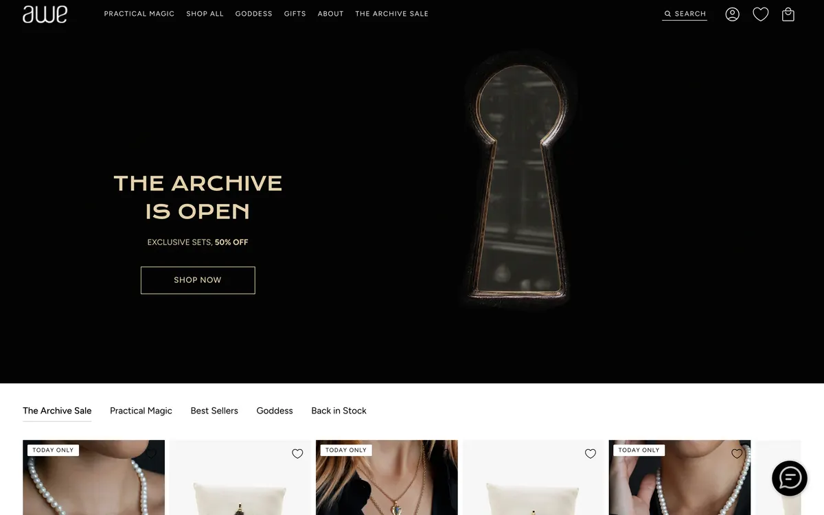
The thematic peer. Goddess and divine-feminine jewellery — the same idea this brand's own copy leads with — executed as a modern direct-to-consumer store.
aweinspired.com- Six items in the top-level menu, five of which lead to something to buy: Practical Magic, Shop All, Goddess, Gifts and The Archive Sale. Only About does not.
- The header is a transparent overlay on the hero, so the photograph starts at the top of the screen instead of 176 px down.
- 'Free Shipping' is stated in the top bar.
- Two JSON-LD blocks on the homepage; on the product page, five, including an aggregateRating — which is what puts a star rating in a Google result.
- A sticky add-to-cart bar was present on the product page at phone width.
Worth borrowingNaming collections as ways in. 'Practical Magic' and 'Goddess' are merchandising ideas promoted to navigation. Pikake, Mana and Haleakalā are stronger names than either, and none of them appears in this store's menu.
Maui Divers Jewelry
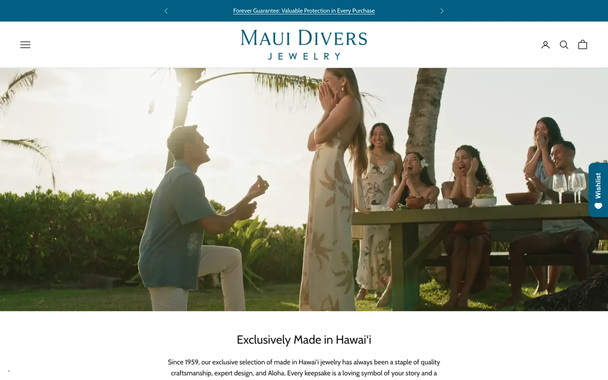
The Hawaii benchmark. Selling since 1959, far bigger than this brand, and the jeweller a visitor to Oahu is most likely to have already walked past.
mauidivers.com- Worth saying plainly: Maui Divers puts its whole menu behind a hamburger on desktop, exactly as this store's phone layout does. A visible category bar is not universal.
- What it does instead is spend the top bar on a promise — 'Forever Guarantee: Valuable Protection in Every Purchase' — rather than on a discount.
- The header is 110 px, the shortest in the set, so the hero starts 66 px higher than it does here.
- A search field is present in the header, and Product Reviews is a link in the primary menu.
- The homepage runs to 14,591 px, three times this store's 4,875 px. Length is clearly not what separates these two.
Worth borrowingThe guarantee in the top bar. This store's free-shipping line is good and already there; a second line about the 14k gold fill guarantee would answer the question a first-time buyer actually has about $59 earrings.
Pura Vida
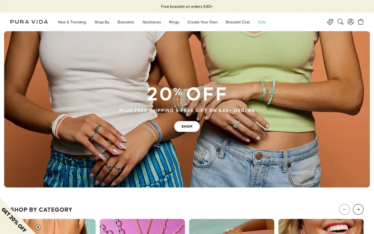
The adjacent benchmark. Beach-lifestyle jewellery at a much lower price point and the most aggressive merchandiser in the set — useful as a contrast rather than as a model.
puravidabracelets.com- Eight items in the top-level menu and seven of them lead to something to buy. It is the only store in the set that puts real category words — Bracelets, Necklaces, Rings — in the header where they can be seen without opening anything.
- Price is treated as a category: '$10 & Under', '$25 & Under', '5 for $30 Charms'.
- 'Free Shipping All Orders' is stated in the top bar.
- 778 requests on the homepage, nearly double this store's 423 — the heaviest store in the set is also the most commercially aggressive one.
Worth borrowingPrice as a way in. This store's jewellery runs $44 to $144, which is a genuinely approachable range that nothing on the site communicates. An 'Under $75' entry point would do real work for a first-time visitor.
Side by side
Noelani Hawaii is the first column. Nothing here is a score — every row is a fact that can be checked by opening the store.
| Checked | Noelani Hawaii | Satya Jewelry | Awe Inspired | Maui Divers Jewelry | Pura Vida |
|---|---|---|---|---|---|
| Items visible in the top-level menucounted on a 1440 px screen | 5 | 6 | 6 | 0 visible | 8 |
| Of those, how many lead to something to buy | 1 — Jewelry | 4 | 5 | 0 — hamburger | 7 |
| Real category names visible without opening a menu | None | No — inside Shop | Yes — Goddess, Gifts, Shop All | No — hamburger | Yes — Bracelets, Necklaces, Rings |
| Search field in the headeras opposed to an icon that opens one | Icon only | Yes | Icon only | Yes | Icon only |
| Structured data blocks on the homepage | 0 | 4 | 2 | 2 | 2 |
| Shipping offer stated in the top bar | Yes — free US shipping over $150 | No — quiz offer instead | Yes — all orders | No — guarantee instead | Yes — all orders |
| Currency switcher | Yes — 6 currencies | No | No | Yes | No |
| Header height before the hero begins | 176 px | 128 px | Overlay — 0 px | 110 px | 120 px |
| Requests to load the homepage | 423 | 808 | 575 | 598 | 778 |
What all four do that this store does not
- Every one of the four publishes structured data on its homepage — between two and four blocks. This store publishes none, on any page. That is the one row in the table where it is alone.
- Three of the four give most of their top-level menu to shopping: five of six at Awe Inspired, seven of eight at Pura Vida, four of six at Satya. Here it is one of five.
- Three of the four spend the top bar on a single promise — free shipping, or a lifetime guarantee. This store already does this well, with the $150 threshold on every page.
- Two of the four hide their categories behind a menu, exactly as this store does, and Maui Divers hides its whole navigation behind a hamburger on desktop. A visible category bar is worth adding, but it is not the thing that separates these stores.
- None of the four beats this store on load weight, currency support, or stating a shipping offer in the top bar. Those three are already won and the redesign should not spend them.
Pain points
The synthesis. Eight problems, ordered by what each costs the business, each linked back to the audit findings that evidence it.
| Pain point | Who it hits | Evidence | What it costs | The fix |
|---|---|---|---|---|
| The buy button is never on screen when the decision is madeF-17 | Marisol | Add to Cart's top edge measures 904 px on a 844 px phone screen, on a 3,585 px page, with no sticky bar. | Every phone visitor who reads the description has to scroll back up to buy. This is the last step of the funnel and it is the one with friction in it. | A sticky bottom bar on phones carrying name, price and Add to cart. |
| A modal stands between the customer and the product on every pageF-01 | Marisol, Kealoha, Rina | The Flodesk modal fills the viewport on arrival and does not dismiss on scroll — it was still covering content at 1,600 px down the product page. | Every visitor pays a dismissal tax before seeing anything, including paid traffic landing directly on a product. | Move the 10% offer to a slim bottom bar on a delay, suppressed on product and cart pages. |
| The shop does not look like a shop on arrivalF-02F-05F-09 | Marisol, Rina | The hero is a five-slide auto-rotating carousel, one slide of which links off-site to a course signup. Four of five top-level menu items lead away from the catalogue. | A visitor arriving from a jewellery search has to work out that this is a jewellery store before they can shop it. | A jewellery hero, a category row beneath it, and Music, Events and Work with Noelani collapsed into one menu. |
| The brand's best asset — its named collections — is invisibleF-06 | Kealoha, Rina | Twelve of eighteen collections, including Pikake, Mana, Haleakalā, Harmony, Mo'orea and Pearls, are not linked from anywhere in the navigation. | The thing that makes this catalogue impossible to copy is the thing a customer cannot browse. Returning customers resort to search. | A two-column menu: Shop by type, and Shop by collection. |
| Nothing on a selling page says anyone has bought this beforeF-19F-28 | Rina, Marisol | The product page's Reviews accordion is empty and no rating appears near the price, while 26 press pages and a testimonials page sit published elsewhere on the site. | The single strongest lever on a jewellery product page is missing, and the trust material to fill it has already been earned and paid for. | A reviews app writing to the product page, seeded from the existing testimonials, plus an 'As seen in' press strip. |
| 102 products cannot be narrowed by anythingF-14F-16F-22 | Marisol, Kealoha | Collection and search pages offer a single 'Sort by' select. No filter by gemstone, price or type, despite 114 tags in the catalogue and 32 products with no product type set at all. | A customer with a specific want — a larimar piece under $100 — has to open products one at a time or leave. | Shopify native filtering on Gemstone, Price and Type, after product_type is set across the catalogue. |
| Google has no price, stock or rating to show for any productF-18 | Rina, Marisol | Zero JSON-LD blocks on any page. All four competitors publish between two and four. | Every organic listing competes without the price, availability and star rating that competitors' listings carry. | Product, Offer, BreadcrumbList and Organization JSON-LD on the templates. |
| The free-shipping threshold is announced and then never mentioned againF-23 | Kealoha | The announcement bar states free US shipping over $150 on every page. The cart shows a subtotal and a checkout button and no progress toward it. | The one lever that reliably raises average order value is stated where it cannot act and hidden where it could. | A cart drawer with a free-shipping progress bar and a row of sub-$50 pieces beneath it. |
How this was made
These are proto-personas, not interview findings. They are built from the store's own catalogue and press, its collection and product data, the four competitors measured on the same day, and the audit's measurements — not from talking to customers. They are a reasonable model of who is arriving and what stops them, and they are a starting point for the real thing. If the store's analytics, order history and any customer emails are available, this section should be rebuilt against them before the redesign is finalised; device split, traffic sources and the actual Japanese share of orders would sharpen all three personas considerably.
What this means for the redesign
- Make the first screen on a phone a shop: a jewellery hero, a category row, no modal.
- Put the buy action within reach at every scroll position, and the cart within reach without leaving the page.
- Give the named collections — Pikake, Mana, Haleakalā, Harmony, Mo'orea, Pearls — a route in, and give the catalogue filters.
- Put the proof on the selling pages: reviews under the price, press under the button, structured data in the template.