Design audit
Twenty-eight findings across eight areas of noelanihawaii.com, ranked by what each one costs. Every finding carries the evidence behind it and exactly one change that fixes it.
Every number on this page was measured on the live store on 7 September 2026, in headless Chrome at 1440 x 900 and at 390 x 844 with a phone user agent. Catalogue counts come from the store's own Shopify JSON endpoints. Nothing here is estimated, and nothing is taken from a Lighthouse score.
What already works
This store has been running for fifteen years and it shows. Five things are already right, and the redesign should be careful not to break any of them.
The product photography is genuinely good
102 products carry 3.1 images each on average, and the strongest listings run to four: on-white, on-model, and a card shot with the affirmation printed on it. Most jewellery stores at this size ship one catalogue photo per product. This is an asset the current layout underuses, not a problem to solve.
Six currencies are already live
The header switches between USD, CAD, GBP, AUD, EUR and JPY. For a brand with press in Japanese, German and Hawaiian outlets going back to 2010, that is the right call and it is already done.
The product naming is a real differentiator
Lā, Pō, Naupaka, Haumāna, Mōhalu, Pikake, Haleakalā, Mana. Hawaiian names attached to specific gemstones and affirmations give this catalogue a reason to exist that a competitor cannot copy. The Gem Guide page backs it up.
Free shipping is stated before the cart
The announcement bar carries the $150 free-shipping threshold on every page. Many stores hide this until checkout, where it converts nobody.
Fifteen years of press is sitting on the site
Women's Health, Freesurf, Waikiki Magazine, Yolo Japan, Surfers Magazine Germany, plus a documentary. There are 26 press pages published. The trust-building material has already been earned; it is only the placement that is wrong.
The numbers
Measured on the live store on 7 September 2026. These are the figures the rest of the page argues from.
904 px
Add to cart on a phone
Its top edge sits 60 px below an 844 px iPhone screen, so it is never visible on arrival
423
Network requests, homepage
121 of them scripts, across 31 separate third-party hosts
4,506 px
Homepage height on a phone
5.3 full screens, carrying four shoppable products and no category link at all
0
Structured data blocks
No JSON-LD on any page, so no price, stock or rating can appear in Google results
176 px
Desktop header height
Announcement bar plus logo band, before the navigation row even starts
17 of 17
Images with no width or height
Homepage. Every one can shift the layout as it loads
66
Tap targets under 44 px
On the phone homepage. The menu button and the cart button are both 24 x 24
6 of 18
Collections reachable from the menu
Pearls, Mana, Pikake, Haleakalā, Harmony, Mo'orea and six more are not linked anywhere in the navigation
84
Published pages in the sitemap
Including events-copy, essential-oils-copy-copy, about-banner and copy-of-music-oct-2021
1.4:1
Contrast on the popup's Subscribe button
White text on #c2dee1. WCAG AA asks for 4.5:1
First contact
What a visitor meets in the first three seconds, before they have scrolled or clicked anything. Two things happen here, and both of them work against the sale.
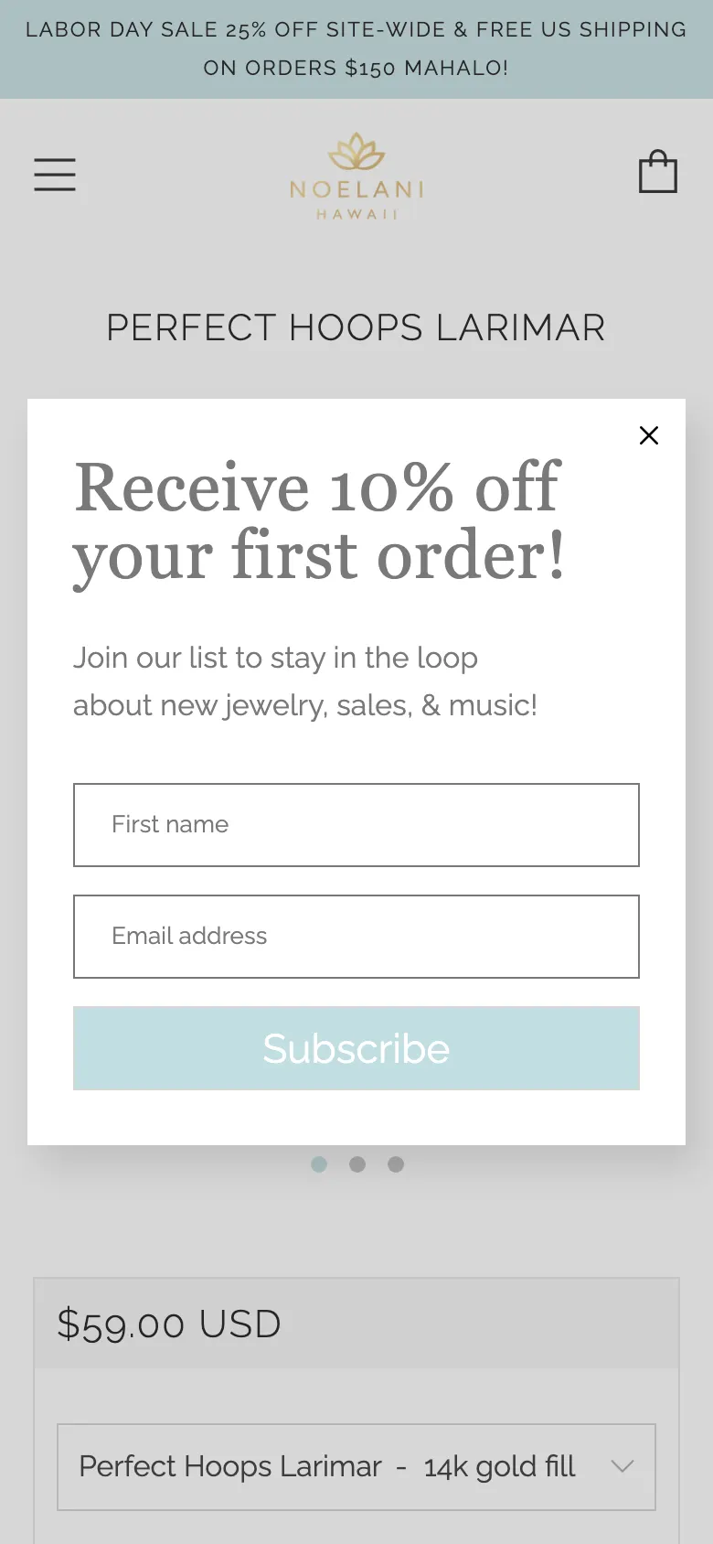
A newsletter popup covers the page on arrival, on every page, and it stays put when you scroll
- Where
- Every page, desktop and phone
- Evidence
- The Flodesk modal (.fd-modal, z-index 1040) mounts a few seconds after load and fills a 1440 x 900 desktop viewport. On the product page it covers the hero image entirely; on the collection page it covers the first row of products; on search results it covers the results. Scrolling to 1,600 px on a phone does not dismiss it — it is still on screen, now covering the related products. The only way past it is the close button.
- Recommendation
- Move the 10% offer out of an on-arrival modal and into a slim dismissible bar anchored to the bottom of the viewport, triggered on exit intent or after 30 seconds, and suppressed entirely on /products/ and /cart. Keep the offer; stop putting it between the customer and the thing they came to look at.
The hero auto-rotates, and the slide that was showing on load both times links off the store entirely
- Where
- Homepage, desktop and phone
- Evidence
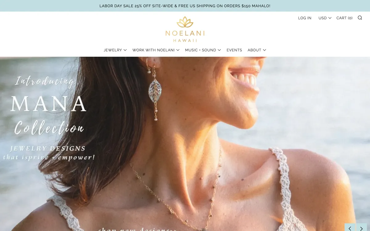
- The hero is a five-slide auto-rotating carousel. Slide one goes to the full jewellery collection, slides four and five to the Mana collection, slide three to the events page — and slide two goes to noelani-hawaii.myflodesk.com/vocalawakening, off the store completely. On both captures of this homepage, slide two was the one carrying slick-current slick-active. What a visitor sees on arrival is decided by timing rather than by merchandising, and one of the five outcomes sends them to a course signup on another domain.
- Recommendation
- Replace the carousel with one fixed hero for the collection currently being pushed — Mana — with a real heading and a single button to /collections/mana-collection. If the vocal course needs promoting, give it a band further down the homepage. A hero that rotates is a hero nobody has decided about, and it costs the store the one screen every visitor is guaranteed to see.
Every word in the hero is baked into a JPEG with empty alt text
- Where
- Homepage, all viewports
- Evidence
- All five hero slides are flat images — 95_1400x.jpg, Body_1_1400x.png, 45_1400x.jpg and the rest — with the headline set inside the file. Every one carries alt="". The Mana slide has a typo in it: 'JEWELRY DESIGNS that isprire + empower!'. Because the text is pixels, that typo cannot be corrected without re-exporting the artwork, the headline cannot be read by a screen reader or a search engine, and the type does not reflow on a phone — it is scaled down with the image.
- Recommendation
- Rebuild the hero as an image with real HTML text over it: an h1, a line of supporting copy and a button, all styled with theme CSS. The photograph stays; the words come out of it. That fixes the typo, makes the headline searchable and readable, and lets the type resize properly on a phone.
The homepage h1 is the logo image, so the page has no headline text
- Where
- Homepage, all viewports
- Evidence
- There is exactly one h1 on the homepage and its text content is an empty string — it wraps the logo img. Measured in the browser, `[...document.querySelectorAll('h1')].map(h => h.textContent)` returns ['']. The first real heading on the page is an h4 reading 'Contact', followed by an h2 'Featured Jewelry'. A screen reader user landing here is told the page's main heading is blank.
- Recommendation
- Put the wordmark in a plain div and give the homepage a real h1 that says what the shop sells — 'Handmade Hawaiian jewellery, made with gemstones and affirmations' — visually styled as the hero headline. Keep exactly one h1 per page and fix the h4-before-h2 order underneath it.
Header and navigation
The menu is the map of the shop. Right now it maps Noelani's whole working life, of which the jewellery business is one fifth.
Four of the five top-level menu items lead away from the shop
- Where
- Header, desktop and phone
- Evidence
- The top-level navigation is JEWELRY, WORK WITH NOELANI, MUSIC + SOUND, EVENTS, ABOUT. One of five is the store. The entire 102-product catalogue sits inside a single JEWELRY dropdown, while 'Vocal Course', 'Sound Healing', 'Concerts', 'Listen Now' and 'Press Kit' each get their own top-level real estate.
- Recommendation
- Promote the categories to the top level — Earrings, Necklaces, Bracelets, Rings, Collections — and collapse Music, Events, Work with Noelani and About into a single 'Noelani' menu on the right. The music and the ceremonies are part of the brand story and should stay on the site; they should not outrank the products four to one in the primary menu.
Twelve of the eighteen collections are not linked from anywhere in the menu
- Where
- Header dropdown, all viewports
- Evidence
- The store's collections.json lists 18 collections. The JEWELRY dropdown links six of them — Beach Bangles, Earrings, Necklaces, Bracelets, Anklets, Rings — plus 'All Jewelry', 'Collections' and 'Gem Guide'. Pearls, Pikake, Mana, Haleakalā, Harmony, Mo'orea, Hoops, Itsy Bitsy Earrings, Affirmation Necklaces, Classics and Featured Jewelry are reachable only by landing on the /collections index or by guessing a URL.
- Recommendation
- Split the dropdown into two columns: 'Shop by type' with the six category collections, and 'Shop by collection' with the named story collections — Pikake, Mana, Haleakalā, Harmony, Mo'orea, Pearls. Those names are the brand's differentiator and they are currently invisible.
The menu and cart buttons on a phone are 24 x 24 px
- Where
- Header, phone
- Evidence
- Measured on the live phone viewport: the Menu button is 24 x 24 px and the Cart button is 24 x 24 px. The WCAG 2.1 AA minimum for a touch target is 44 x 44 px. 66 separate tap targets on the phone homepage fall under 44 px, including the hero carousel dots at 9 x 9 px. The menu button is the only route to the catalogue on a phone.
- Recommendation
- Give the menu and cart buttons a 44 x 44 px hit area by padding the button rather than scaling the icon, so the glyph stays 24 px and the tappable box grows around it. Drop the 9 px carousel dots for a swipe gesture plus 44 px arrows.
Two category links in the menu point at malformed nested URLs
- Where
- Header dropdown, all viewports
- Evidence
- The Bracelets link resolves to /collections/bracelets/bracelets and the Rings link to /collections/rings/Rings — a collection handle repeated as a path segment, with inconsistent capitalisation. Both still render, because Shopify tolerates the extra segment, but they generate duplicate URLs for the same collection and split any ranking signal between them.
- Recommendation
- Point both links at /collections/bracelets/ and /collections/rings/ and add a 301 from the doubled paths to the canonical ones.
Homepage
The homepage is 4,875 px tall on desktop and 4,506 px on a phone. The question is what a visitor gets for that scroll.
The phone homepage shows one product at a time, and those four are the only shoppable items on it
- Where
- Homepage, phone
- Evidence
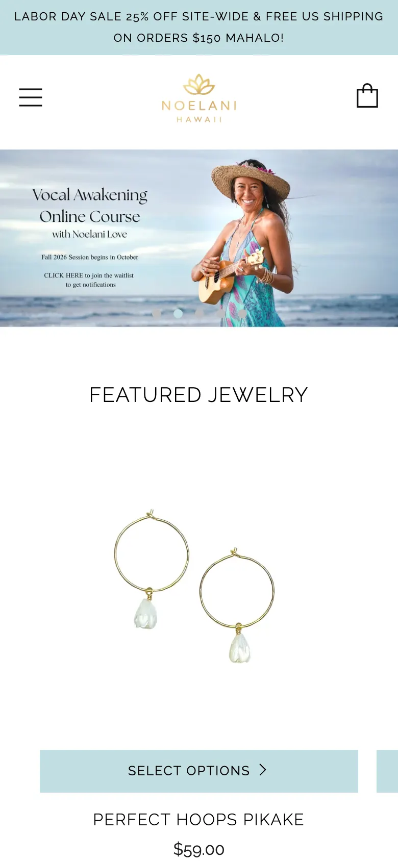
- The phone homepage is 4,506 px — 5.3 screens at 844 px. Credit where it is due: once the popup is dismissed, the first featured product does fall inside the opening screen, at roughly 500 px. But Featured Jewelry is a horizontal carousel showing one card at a time, so a visitor sees a single product and a sliver of the next. Those four products are the only shoppable items on the entire page; the remaining 3,700 px are a documentary embed, an Events block, a Music block, an About block and an Instagram feed. No category link appears anywhere on the page.
- Recommendation
- Turn Featured Jewelry into a two-across grid on phones so four products are visible in two thumb-lengths instead of four swipes, and put a category row directly beneath it — Earrings, Necklaces, Bracelets, Rings, four images and four words. That gives the page a route into the other 98 products, which it currently does not have at all.

Six YouTube players and a stack of app scripts load on the homepage whether or not anyone uses them
- Where
- Homepage, desktop
- Evidence
- Measured on load: 423 network requests, 121 of them scripts, reaching 31 distinct third-party hostnames including six YouTube and Google video hosts, Flodesk, Instagram, Facebook, DoubleClick, LayoutHub, Daily Karma, Visual Quiz Builder, Plyr, cdnjs and jsDelivr. Desktop load took 6.0 seconds. In fairness, that request count is the lowest of the five stores measured for this proposal — Satya runs 808, Pura Vida 778 — so the problem is not bulk, it is that a large share of this particular load is avoidable: six YouTube players mount whether or not anyone presses play, and the theme still loads jQuery on every page.
- Recommendation
- Replace the six YouTube iframes with click-to-play poster images that only load the player on tap — that alone removes most of the third-party weight. Then audit the app list: Visual Quiz Builder, LayoutHub and Daily Karma are each loading on the homepage, and any that are no longer in use should be uninstalled rather than disabled.
None of the homepage images declare a width or height
- Where
- Homepage, all viewports
- Evidence
- 17 of 17 images on the desktop homepage have no width or height attribute, and none are marked loading="lazy". Every one of them can push the content below it down as it arrives, which is what produces the layout shift a visitor feels as the page 'jumping' while they are trying to tap something.
- Recommendation
- Add width and height to every img in the theme so the browser reserves the box before the file arrives, and set loading="lazy" on everything below the hero. The hero image keeps loading="eager" and gains a preload tag.
Twelve of seventeen homepage images have no alt text
- Where
- Homepage, all viewports
- Evidence
- 12 of 17 images on the homepage have no alt attribute at all. On the product page the count is zero missing, so the theme is capable of it — the homepage sections are where it was skipped. A screen reader announces these as unlabelled graphics, and Google has nothing to read from them.
- Recommendation
- Write alt text for each homepage image describing what it shows — 'Noelani wearing the Pikake necklace on the North Shore' rather than 'banner1'. Where an image is purely decorative, set alt="" explicitly so it is skipped rather than guessed at.
Collection pages
The collection page is where a browsing customer decides whether this shop has what they want. With 102 products and 18 collections, this page is doing a lot of work.
A full desktop screen passes before the first product appears
- Where
- Collection pages, desktop
- Evidence
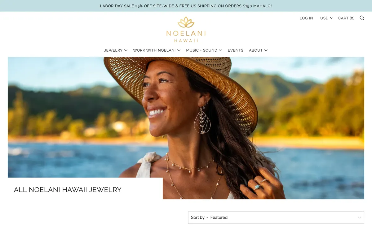
- On /collections/all-noelani-hawaii-jewelry at 1440 x 900, the banner image occupies the viewport from the 176 px header down past 900 px. The collection title sits at roughly 1,020 px and the 'Sort by' control at about 1,170 px. The first product image starts below that. A visitor on a laptop sees a banner and a heading, and has to scroll to learn the shop has anything in it.
- Recommendation
- Cap the collection banner at 240 px tall with the title overlaid on it, so the first row of products falls inside the opening screen. The banner is currently a visibly upscaled, soft image; a shorter crop will also look sharper.
There is no way to filter 102 products by anything
- Where
- Collection pages, all viewports
- Evidence
- The only control on the collection page is a single 'Sort by — Featured' select. There is no filter by gemstone, by metal, by price or by product type, despite the catalogue carrying 114 distinct tags and prices ranging from $44 to $144 across the jewellery lines. A customer who wants a larimar piece under $100 has to open products one at a time.
- Recommendation
- Turn on Shopify's native filtering with three facets: Gemstone, Price and Type. The tag data to power it is already on the products. Put the filters in a left rail on desktop and behind a 'Filter' button on phones, with the active filters shown as removable chips above the grid.
The product card's only action is a button labelled 'Select options'
- Where
- Collection, search and related products, all viewports
- Evidence
- Every product card carries a pale seafoam button reading 'SELECT OPTIONS ›'. It is not an add to cart and it is not a link to the product — it reads as a form control for a decision the customer has not been asked to make yet. On products with a single variant it is especially misleading, because there are no options to select.
- Recommendation
- Make the whole card a link to the product page and drop the button, or replace the label with 'Add to cart' for single-variant products and 'Choose a size' for multi-variant ones. One clear action per card, named for what it does.
32 of 102 products have no product type set
- Where
- Catalogue data
- Evidence
- Read from the store's products.json: 32 products have an empty product_type field, including Haumāna Earrings, Pō Necklace, Naupaka Necklace and Puhi Earrings. Three products are also mistyped — Hina Earrings and Lā Earrings are both filed under 'Necklaces'. Product type is what any filter, any automated collection and any Google Shopping feed sorts on.
- Recommendation
- Set product_type on all 102 products from a fixed list of six — Earrings, Necklaces, Bracelets, Anklets, Rings, Other — and correct the three miscategorised items. This is an afternoon in the Shopify admin and it unblocks filtering, automated collections and the shopping feed at once.
Product pages
This is where the money is made or lost. A customer needs three answers on the first screen: what is it, what does it cost, and how do I buy it.
Add to cart sits below the fold on a phone and there is no sticky bar to bring it back
- Where
- Product pages, phone
- Evidence
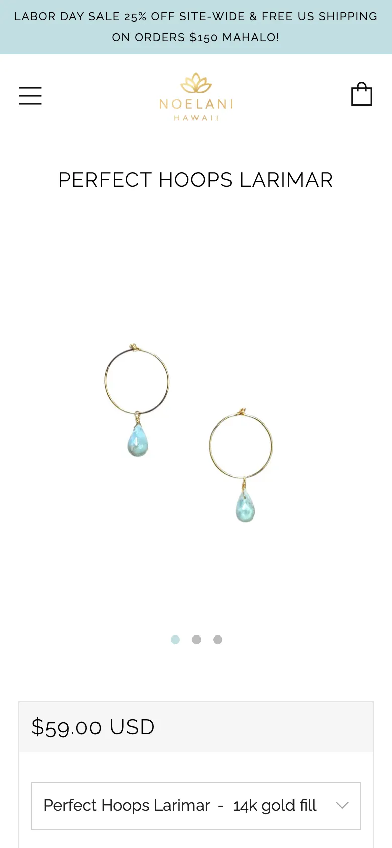
- On /products/perfect-hoops-larimar at 390 x 844, the Add to Cart button's top edge is at 904 px — 60 px below the bottom of the screen on arrival. The page is 3,585 px tall, so a customer who scrolls down to read the description and the 14k gold fill note has to scroll back up to buy. There is no sticky add-to-cart bar. The button itself is 328 x 48 px, which is a good size; it is simply never on screen when the decision is made.
- Recommendation
- Add a sticky bottom bar on phones that appears once the main Add to Cart scrolls out of view, carrying the product name, the price and an Add to cart button. This is the single highest-value change on the list: it puts the buy action in reach at every point of the 3,585 px page.
No product page carries structured data, so Google cannot show a price or stock status
- Where
- Every page, all viewports
- Evidence
- Counted in the live DOM: zero script[type="application/ld+json"] blocks on the homepage, the collection page, the search page and the product page. The theme uses the older http://schema.org microdata for Product and Offer instead. There is no BreadcrumbList and no Organization JSON-LD anywhere on the store.
- Recommendation
- Add a JSON-LD Product block to the product template with name, image, description, sku, brand, and an Offer carrying price, priceCurrency and availability read from the variant. Add BreadcrumbList to collection and product pages and Organization to the layout. This is what makes a price, a stock status and a review count appear under the listing in Google.
The Reviews tab on the product page is empty
- Where
- Product pages, all viewports
- Evidence
- The product page renders an accordion heading 'Reviews' with an 'Open tab' control and no review content behind it, and there is no rating shown anywhere near the price. The store has a /pages/reviews page and a /pages/share-review page, so reviews are being collected somewhere — they are just not on the page where the buying decision happens.
- Recommendation
- Install a reviews app that writes to the product page — Judge.me or Loox — and surface the star rating directly under the product title, above the price. Seed it by importing whatever testimonials already exist on /pages/testimonials. Social proof next to the price is the strongest single lever on a jewellery product page.
Add to Cart is the palest button on the product page, and the second metal is hidden inside a dropdown
- Where
- Product pages, all viewports
- Evidence
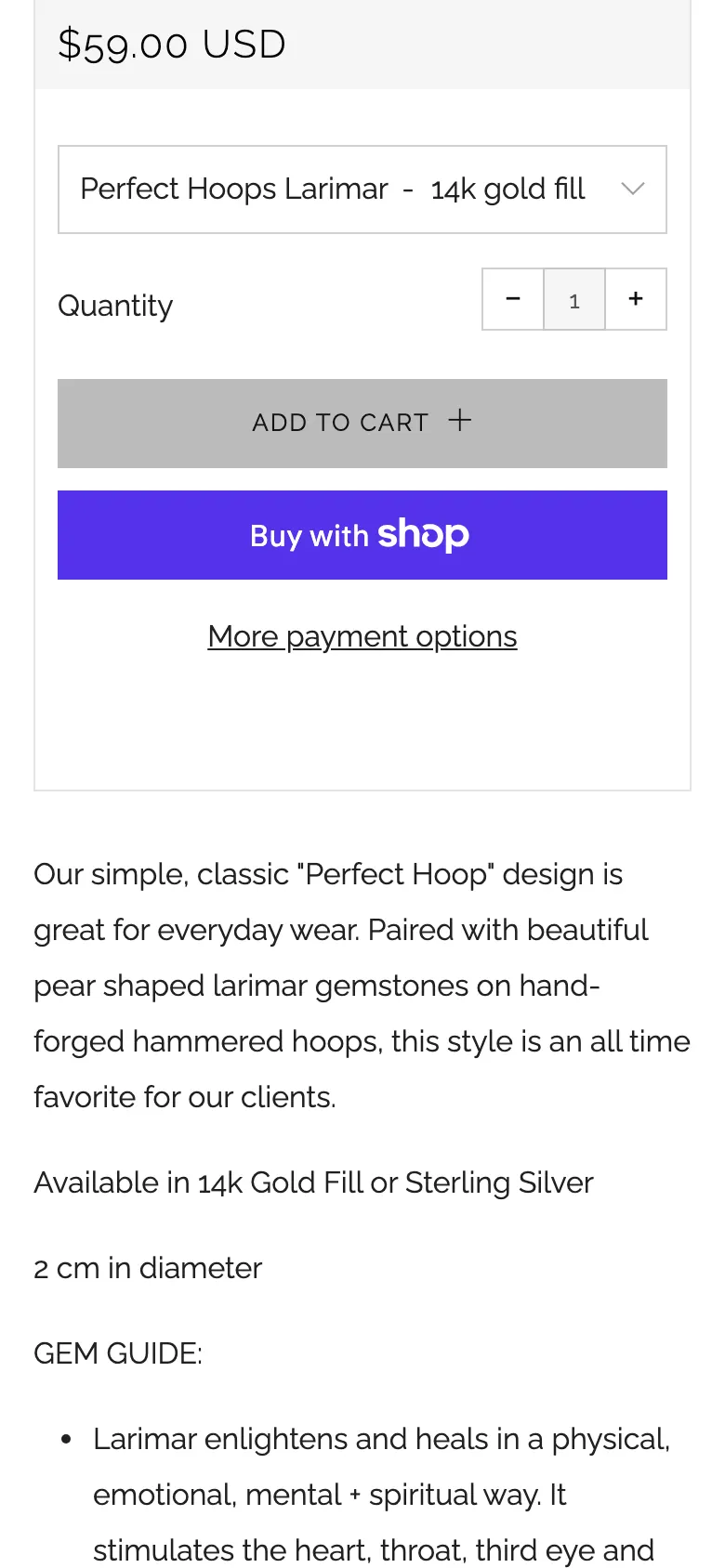
- Measured on the live page: the Add to Cart button is #e4e4e4 — light grey — at 328 x 48 px, sitting directly above a saturated purple Buy with Shop button. The store's own primary action is the quietest thing in the group. Above it, a dropdown displays 'Perfect Hoops Larimar - 14k gold fill', repeating the product title inside the control, while the description underneath separately explains 'Available in 14k Gold Fill or Sterling Silver'. The underlying select options are already clean — just '14k gold fill' and 'Sterling silver' — so the duplication is display only.
- Recommendation
- Give Add to Cart the brand's own seafoam fill with dark text, so the store's primary action is at least as loud as the wallet button beneath it, and replace the metal dropdown with two labelled buttons — 14k Gold Fill and Sterling Silver — showing the price and image update on selection. Both changes are in the same theme section.
Two products have no image at all and seventeen have only one
- Where
- Catalogue data
- Evidence
- From products.json: 'Kelly Moorea balance' ($3,000) and 'Jewelry Repair' have zero images and descriptions under 80 characters. 17 further products carry a single image, including Leilani Necklace and Galaxy Twist. The catalogue average is 3.1 images per product, so these are the exceptions rather than the standard.
- Recommendation
- Hide 'Kelly Moorea balance' and 'Jewelry Repair' from the catalogue — they are service or invoice items, not products a browsing customer should meet — and photograph the 17 single-image products to the same three-shot standard as the rest: on-white, on-model, and the affirmation card.
Search and cart
Search is where a customer who knows what they want goes. The cart is the last screen before the money.
Search results show no result count and cannot be filtered or sorted
- Where
- Search results, all viewports
- Evidence
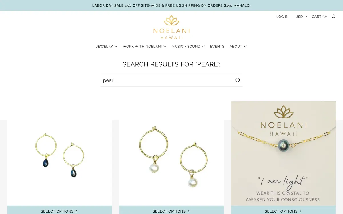
- Searching 'pearl' returns a page whose h1 reads 'Search results for "pearl":' — with a trailing colon — followed by 4,469 px of product grid with no count, no filters and no sort control. The customer cannot tell whether they are looking at eight results or eighty, and cannot narrow them.
- Recommendation
- Rewrite the heading as '14 results for "pearl"' with the real count, and carry the same filter and sort controls from the collection page onto search. Add an empty state that suggests the six main categories when a search returns nothing.
The cart is a full page redirect with no free-shipping progress
- Where
- Cart, all viewports
- Evidence
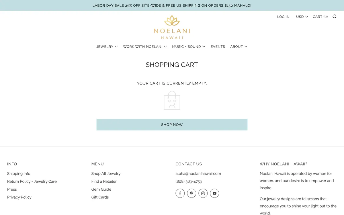
- Adding an item leaves the product page and loads /cart as a full page. The announcement bar states free US shipping over $150, but the cart itself shows no progress toward it — a customer with $118 in the cart is not told that $32 more removes the shipping charge, at the exact moment that information would add an item.
- Recommendation
- Switch to a slide-out cart drawer using the Section Rendering API so adding an item never leaves the product page, and put a free-shipping progress bar at the top of it: 'You're $32 away from free US shipping.' This is the standard way to lift average order value on a store with a stated threshold.
Typography and colour
The store runs on one typeface at one weight, and one accent colour used for both decoration and buttons.
White text on the pale seafoam button gives a contrast ratio of 1.4:1
- Where
- Newsletter popup, and any button using the seafoam fill
- Evidence
- The popup's Subscribe button is white text on #c2dee1, the theme's accent value, which measures 1.4:1. WCAG AA requires 4.5:1 for body text and 3:1 for large text. The same seafoam is used for the 'Select options' buttons across collection and search, where it carries dark text and passes — so the palette is fine, it is the white-on-seafoam pairing that fails.
- Recommendation
- Use the existing dark ink on the seafoam fill for every button, as the collection cards already do, and reserve white text for a darker accent. If a filled button needs white text, darken the fill to at least #3f7f8b, which clears 4.5:1.
Headings, buttons, product titles and the announcement bar are all set in capitals
- Where
- Every page, all viewports
- Evidence
- The announcement bar, the navigation, product titles ('PERFECT HOOPS LARIMAR'), section headings ('FOLLOW ME ON INSTAGRAM', 'WHY NOELANI HAWAII?') and every button ('SELECT OPTIONS') are all uppercase Raleway. On a phone the announcement bar alone wraps to two lines of capitals. Capitals slow reading measurably because word shapes disappear, and with everything capitalised nothing is emphasised.
- Recommendation
- Set product titles, section headings and buttons in sentence case, and keep capitals for the small navigation labels only. Introduce a display face for headings so the hierarchy comes from the typeface rather than from shouting.
An English heading carries its Japanese translation inline
- Where
- Product pages, all viewports
- Evidence
- The product page accordion heading reads 'WHAT IS 14K GOLD FILL? とは?お手入れ方法は?' — English and Japanese in one heading. The store has a /pages/noelani-hawaii-japanese page, a /pages/jp-shipping page and JPY in the currency switcher, so there is a real Japanese audience being served by doubling up the copy rather than by a language switcher.
- Recommendation
- Add Shopify Markets with a Japanese locale and a language switcher beside the currency selector, then split the doubled headings into one language each. The Japanese audience is already there and already buying; it deserves its own version of the store rather than a suffix.
Site structure
Fifteen years of a working brand leaves a lot behind. Some of it is an asset that is not being used, and some of it is clutter that is still published.
The sitemap publishes 84 pages, including working copies and orphaned banners
- Where
- Site structure
- Evidence
- The published page sitemap includes events-copy, essential-oils-copy-copy, essential-oils-copy-1, copy-of-music-oct-2021, copy-of-covid-19-shipping-updates, about-banner, jewelry-banner-about, home-banner, noelani-bio and noelani-bio-2025 alongside the real pages. Two separate bio pages are live; the header links to the 2025 one.
- Recommendation
- Unpublish every page with 'copy', 'banner' or a stale date in its handle, and 301 the old bio to the current one. Keep the 26 press pages — those are an asset — but pull them together under one /pages/press index instead of leaving each floating in the sitemap on its own.
Fifteen years of press is published but never appears on a page that sells anything
- Where
- Homepage, product pages
- Evidence
- 26 press pages are live — Women's Health, Freesurf 2019 through 2022, Waikiki Magazine, Surfers Magazine Germany, Yolo Japan, Hawaii Magazine Japan, Guido — plus a documentary embedded on the homepage. None of it appears on a product page, and on the homepage it is represented only by the documentary video, roughly two thirds of the way down.
- Recommendation
- Build a single 'As seen in' strip of publication wordmarks, put it directly under the hero on the homepage and again under the Add to cart on product pages. Fifteen years of press is the strongest trust signal this brand has and it is currently filed rather than shown.
Where to start
Twenty-eight findings is a roadmap, not a Monday. These three come first because each one is small, each one is on the path a paying customer actually walks, and none of them depends on the other twenty-five being done.
Take the popup off the product and cart pages
It is one setting in Flodesk and it stops every visitor paying a dismissal tax before they can see what they came for. Nothing else on this list is this cheap.
Add a sticky add-to-cart bar on phones
The buy button currently sits 60 px below the fold on a 3,585 px page. This is a theme change measured in hours, and it is the last step of the funnel.
Put the categories in the header and the collections in the menu
Six of eighteen collections are linked anywhere. Pikake, Mana and Haleakalā are the names that make this catalogue impossible to copy, and no one can browse them.