Redesign proposal
Noelani Hawaii
A jewellery store with fifteen years of press, 102 products and a catalogue nobody else could copy — sold through a storefront that hides most of it.
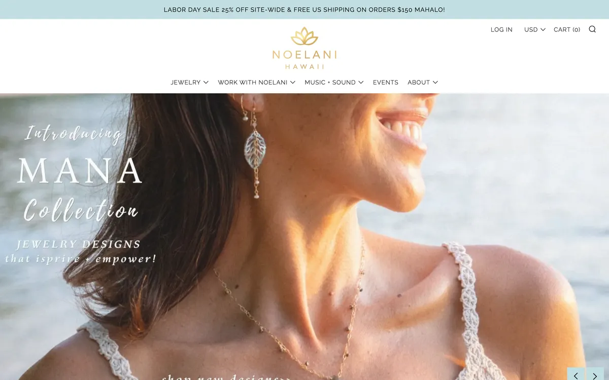
The store already has the hard parts. The photography is good, six currencies are live, the free-shipping threshold is on every page, and the product names — Lā, Pō, Naupaka, Pikake, Mana — are a genuine competitive moat. What it does not have is a path from arrival to checkout that stays out of the way.
Over two days the live storefront was measured in a real browser at desktop and phone sizes, its catalogue was read from its own Shopify endpoints, and four competitors were put through the same checks on the same day. That produced twenty-eight findings and eight pain points. The redesign that follows answers the four that cost the most.
What is in here
Design audit
Twenty-eight findings across eight areas of the live store, each with a screenshot, a measured number or a line quoted from the page, and one change that fixes it.
Open the audit
UX research
Three proto-personas built from the catalogue and the brand's own press, three shopping journeys compared today against proposed, four competitors measured side by side, and eight pain points ranked by what they cost.
Open the research
Redesign
The storefront concept the audit and the research point to, with the homepage built and running: one scroll carrying the brand story, the catalogue, the gem guide and the music, each section answering a priority the research set.
Open the redesign
Four numbers from the audit
904 px
Add to cart on a phone
Its top edge sits 60 px below an 844 px iPhone screen, so it is never visible on arrival
0
Structured data blocks
No JSON-LD on any page, so no price, stock or rating can appear in Google results
66
Tap targets under 44 px
On the phone homepage. The menu button and the cart button are both 24 x 24
6 of 18
Collections reachable from the menu
Pearls, Mana, Pikake, Haleakalā, Harmony, Mo'orea and six more are not linked anywhere in the navigation